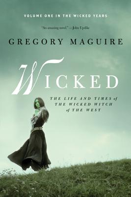
I love the first two versions of Gregory Maguire's Wicked. The first (with a cool circular cut-out) gives a great feeling of the magical elements of the series. The second features the poster art of the Broadway musical inspired by the book. I'm not often a fan of media tie-in covers, but this one is just graphically awesome. It also features bright green page edges, which makes it really eye-catching on bookstore displays.


One would think two was enough, but the other day I came across the third round of Wicked covers... and it seems the publisher wants to recall "Little Witch on the Prairie." Why why why??
No comments:
Post a Comment